How were the finalists in Georg Jensen's recent design competition actualy selected?
In the autumn of 2020, The Danish jewelry company Georg Jensen announced a design competition in which the whole country was invited to design a piece of jewelry which would celebrate Her Majesty Queen Margrethe's 50th government anniversary - and at the same time be in line with Georg Jensen's design heritage, because the winning design was to be produced and sold by the old jewelry company. Of course I participated!
Here is Georg Jensen's own description of what they wanted:
Your design proposal must be able to function both as a pendant and a brooch. In addition, it must contain elements which pay homage to Her Majesty the Queen, the Government Anniversary or both. The design must be in silver. The design can include a gold element by, for example, being gilded or having a gold insert. The design can also include a colored element such as a stone or enamel.
The whole thing was launched with a beautiful (english spoken) video on the website:
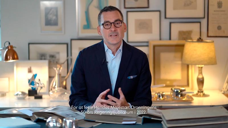
(Link may cease to operate when competition ends)
I of cause jumped at the occasion and immediately had a number of thoughts:
My piece was to be based on a brooch which was gifted to the then young princess by her father, King Frederik IX. It has the shape of a horseshoe studded with rubies and placed on a horizontal bar (or maybe a riding whip?). There are no official close up pictures of the piece and hence we have to guess from the relatively few existing pictures of Her Majesty wearing the brooch. For good reasons, this brooch has great sentimental value, and the Queen wore it on the day her father exhaled and she was proclaimed Queen of the Danes. It has since been seen regularly adorning her.
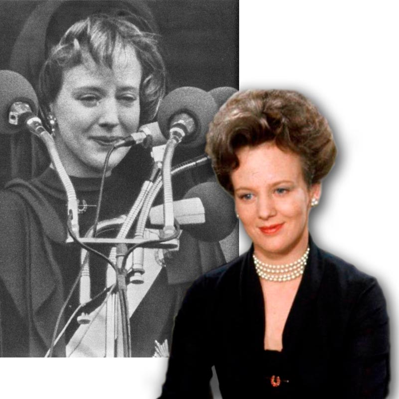
As mentioned, until recently there were no good close-ups of the brooch, but I imagined it to look something like this:
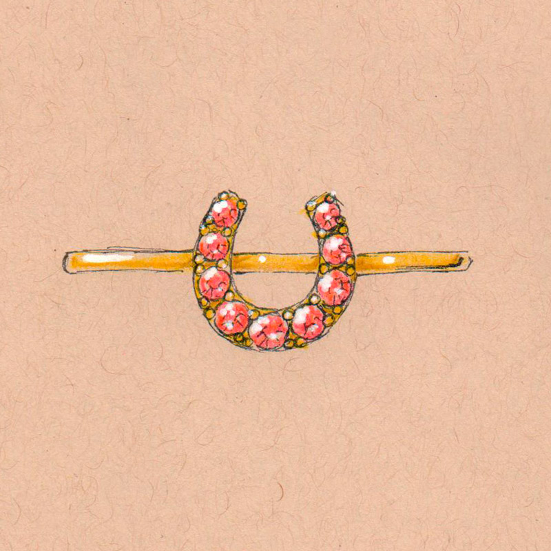
In the meantime, a perfect close-up picture has been made accessible, due to the fact, that it currently is on display at Amalienborg (the Queens residence) as part of the exhibition "A Queens Jewellery Box". Suddenly it is possible to see, that the brooch is somewhat more detailed than I had imagined. It for instance features 10 small antique cut diamonds (probably taken from repurposed royal jewellery):
 Photo: Jens Peter Engedal
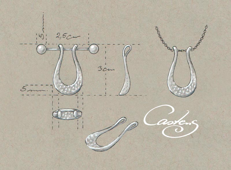
Many of the designs which we associate with Georg Jensen are soft, fluid and sport an either polished or hammered surface. Therefore I turned the horseshoe shape of the original brooch into a significantly more fluid drop shape. As prompted, my piece was designed to be used both as a necklace / pendant and as a brooch, but I approached this concept in a slightly alternative way:
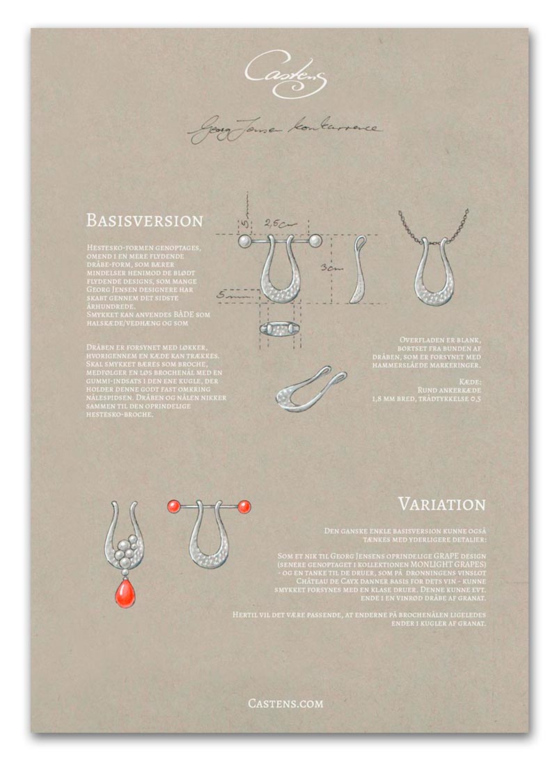
The drop was provided with loops through which a chain could be pulled. If the pendant was to be worn as a brooch, a loose brooch needle was included with a rubber insert in one of the two balls at each end, which thus held the needle securely. Together, these two elements nodded to the shape of the original horseshoe brooch. The surface was planned to be polished, except for the bottom of the drop, which was to be provided with hammered markings - again very true to Georg Jensen's original idiom. The advantage of working with a loose brooch needle instead of just placing the needle on the back of the jewelry is that it is far more comfortable to wear when worn as a pendant. It goes without saying that such a brooch pin mechanism between the pendant and the skin can be a bit irritating and to me comfort when wearing one of my pieces is paramount.
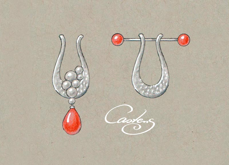
The very simple basic version could also be created with further details: As a nod to Georg Jensen's original GRAPE design (later resumed in the MONLIGHT GRAPES collection) - and with a thought of the grapes grown at the Queen's wine castle Château de Cayx in France - the piece can be adorned with a bunch of grapes. This could possibly end in a wine-colored drop of garnet. For this version it would be appropriate that the ends of the brooch needle also were terminated with balls of garnet.
I handed it all in like this: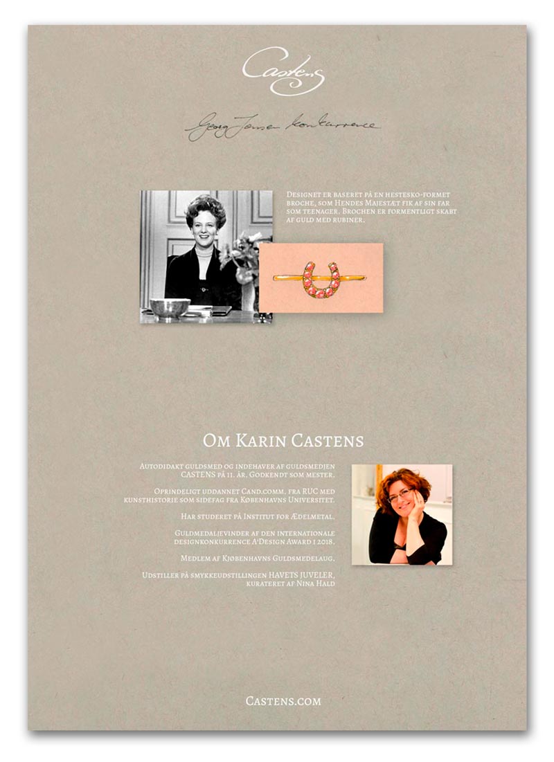
 A fine contribution to the competition, if I may say so. However, I did not win. I did not even get to the finals announced on the Queen's birthday (16th of April). These three pieces were then turned from drawings into models, enabling the five judges - and all Danes who wanted to vote (the 6th judge you might say) – to determine the winner. This was done by presenting copies of the three contestants in selected Georg Jensen stores and online.
Unfortunately, I have to say that I was a bit underwhelmed by the three chosen designs, which seemed relatively similar: All were roughly circular and created in an angular, somewhat minimalistic style.
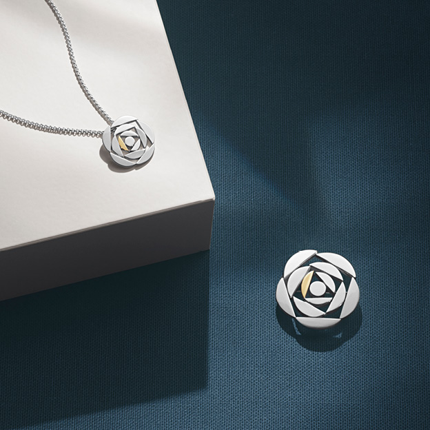
Most dull was the piece by jeweler Ditte Stepnicka: A decoupage-inspired flower. This was a very 2-dimensional piece, which could be said to resemble a less sumptuous version of Chanel's Camellia brooch. Yes, the queen likes to express herself in decoupage, but her works have far more depth and elegance than this naive paper clip - piece. Not worthy of our queen, I think, which I find a little surprising, because Dittes other work is far more dynamic and elegant in their minimalism. I can recommend taking a look at Ditte's page!
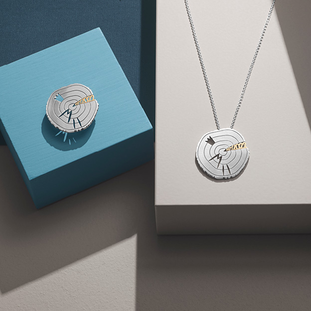
Torkil Oxe is an architect and graphic artist who contributed with a brooch, which… had humor? At least that was the vibe I sensed when I saw the picture of a slice of wood with 5 year-rings (one for each decade of her reign), the year 2021 squeezed into a crack in the wooden disc as well as a stylized crown and an M II. Its style is funny and somewhat naive. But pretty? Not so much.
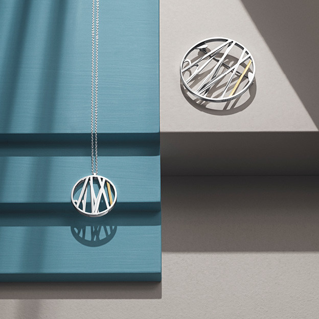
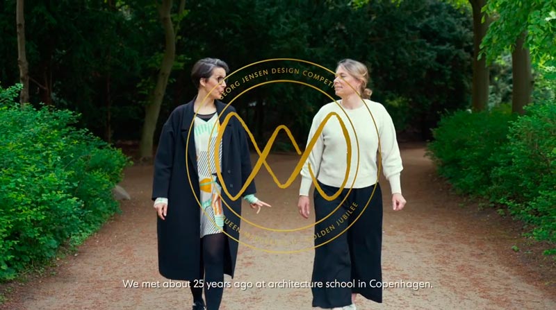
Ditte Bjerregaard and Sofie Elkjær Jensen are both architects and Sofie also works with graphics. Together, they have designed a 3-dimensional piece of jewelry which nods to the setting on a stage. Something that makes good sense in relation to the times when Her Majesty has worked with scenery and costumes. The piece is interesting in this respect, because here, unlike the other two, you find consciously created depth which one can explore. Is it beautiful? Well… it does not match my aesthetics, and hence I am not thrilled, but it was in my opinion the most exciting contribution among the finalists.
All three feature a brooch pin on the back as well as an eyelet, enabling the wearer to use it both as a brooch or a pendant. None of them had worked a little more creatively with the brooch needle and to be completely honest, I do not think that any of them have succeeded in capturing Georg Jensen's more organic aesthetics, as we for example. see with the designs Mercy, Offspring or Heritage which is a remake or at least strongly inspired by the jewelry which Georg Jensen himself created over 100 years ago.
All three works relate to our queen, but as I said, I do not recognize anything from the venerable company, which also wanted to celebrate their almost 120 years anniversary by putting the winning jewelry into production. I doubt it will be a bestseller. Maybe I am mistaken - I hope so for Georg Jensen. Why the jury ended up selecting precisely these three works I do not know. I think they are very similar: all flat, angular and more or less minimalist. I have not seen other contributions, and do not know if there were more soft designs to be found amongst them. In general, I think the judges have failed to select three proposals which are different enough from each other. Taste can always be discussed and is inherently a subjective discipline, but it would have honored the panel if they had been able to pick finalists who covered a more wide selection of styles and design ideas.
So who won?
In the end, it was Ditte Bjerregaard and Sofie Elkjær Jensen who, with their scenography-inspired design, were announced the winners on the 22nd of June. Congratulations to the team which I thought were the best of the three finalists.
And what about my design? Well… now that it did not become an official Georg Jensen design, it is 100% mine and I can work with it if I want. And also make some alterations. I think I prefer more of a milled than hammered surface and I do not know if I want to work with the red gems - maybe rather white pearls?
Time will tell if I will realize this design or maybe develop the idea into something completely different, though I will probably explore the concept of the loose brooch needle further. In fact, I recently used this design when I created this fingerprint pendant which my client wanted to be able to wear as a brooch as well. With such a needle, pretty much any pendant can be turned into a brooch and to me THAT is definitely an interesting result of this competition, to be explored in the future!
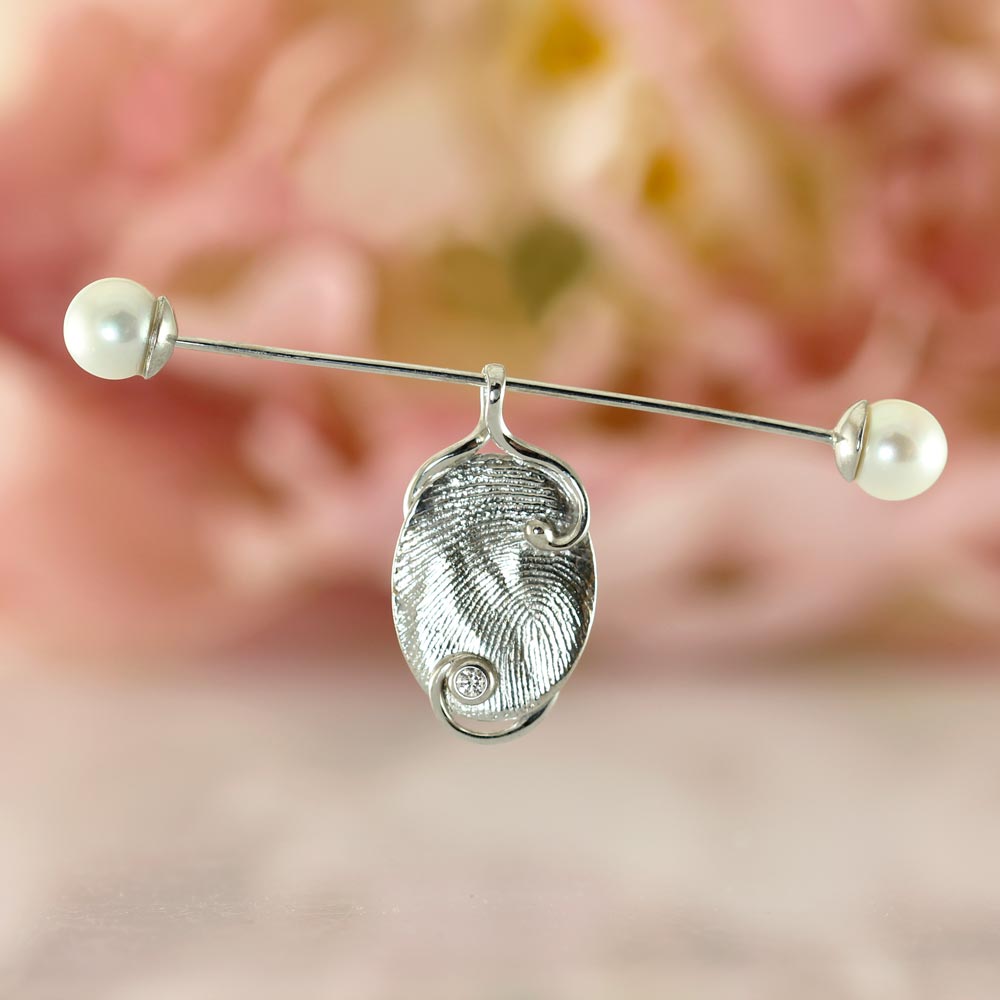
If you feel inspired to have your very own version of this design created, you are of course welcome to contact me.

 RSS Feed

