

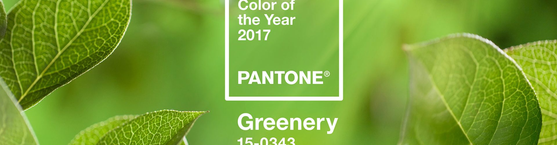
Each year, Pantone declares a specific colour to be the ”Pantone Colour of the Year”. This colour (along with a range of other colours that match or contrast particularly well with the chosen colour) serves as a guideline, especially for the fashion industry, when deciding on the shades that will characterise upcoming fashion. Pantone is not all-powerful and not every colour they choose hits the mark every year, but there is a strong tendency for them to be very skilled at predicting (or even dictating) which colour will become popular next year.
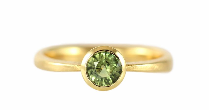 18ct gold solitaire with a 0.77 ct green sapphire
This year they have chosen the colour “Greenery”, which is a lovely yellowish-green shade. As they describe it themselves: “Greenery symbolises, with its refreshing and revitalising colour, new beginnings”. So true – especially since green is such a wonderfully life-affirming colour! Not least because most plants that grow (and thrive) are green, and therefore we naturally associate the colour with health and growth. In the USA, their dollar bills are green, so there “the green stuff” also means prosperity – another form of growth. Read more about the colour of the year here: https://www.pantone.com/color-of-the-year-2017
Perhaps we here at Castens were ahead of the green trend – or perhaps I and our customers simply love the colour green. Regardless of the reason, we have already created many types of jewellery with green gemstones – especially peridot or olive-coloured diamond, which are the stones that come closest to ”Greenery's” yellowish-green hue.
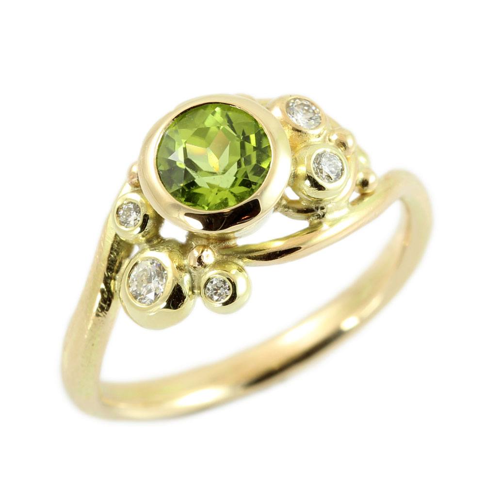
14ct Embrace gold ring with peridot and 0.12 ct TW/VVS diamonds 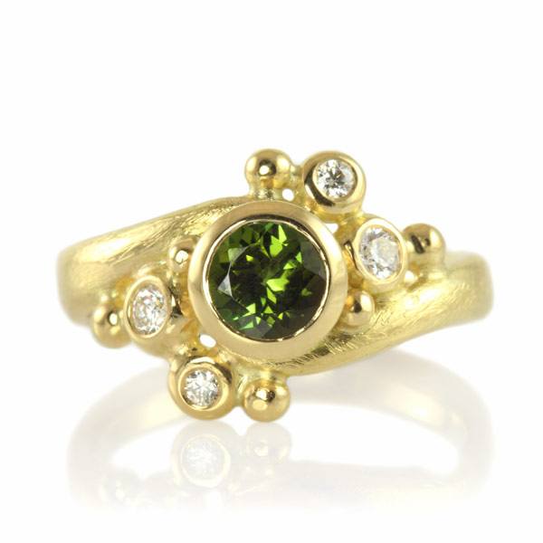 18ct Embrace gold ring with green tourmaline and a total of 0.1 ct TW/VVS diamonds
They say that green is good for the eyes, and we think that when it sparkles, it's even better! Pantone's Greenery is so beautiful in combination with cool silver and especially glowing gold. In contrast to the warmth of gold, ”Greenery” radiates optimism and a bubbling positivity that works wonders for most people's mood 🙂
Most of the jewellery shown in this article are one-offs, and sold to a happy customer. Therefore, they cannot (any longer) be seen in my shop. However, my crew and I are constantly creating new jewellery for the display cases and the customers who also feel inspired by these juicy harbingers of spring.
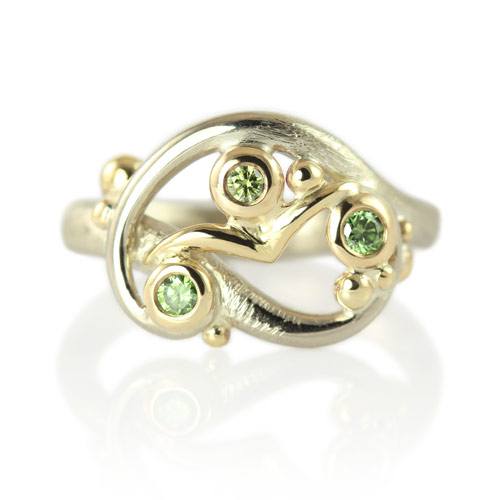
Freedom ring in 14k white gold with 18k yellow gold details with a total of 0.14 ct green diamonds
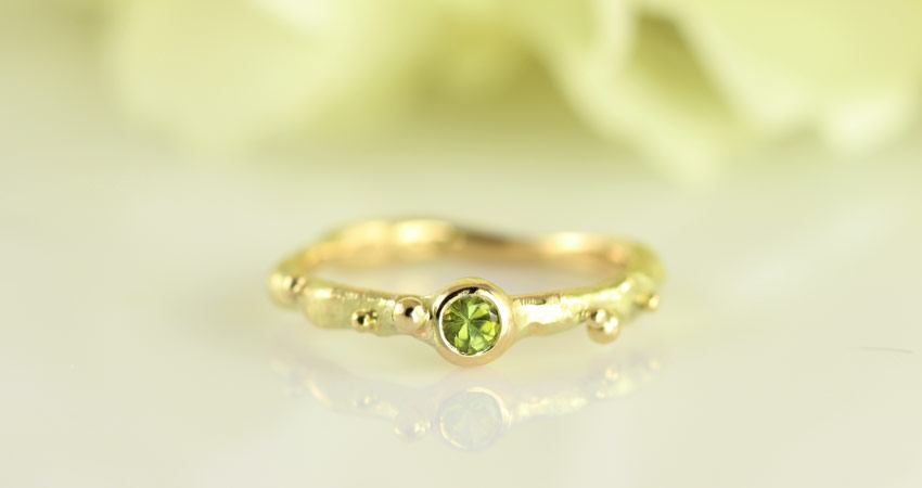
The troll princess's 14ct gold ring with green tourmaline
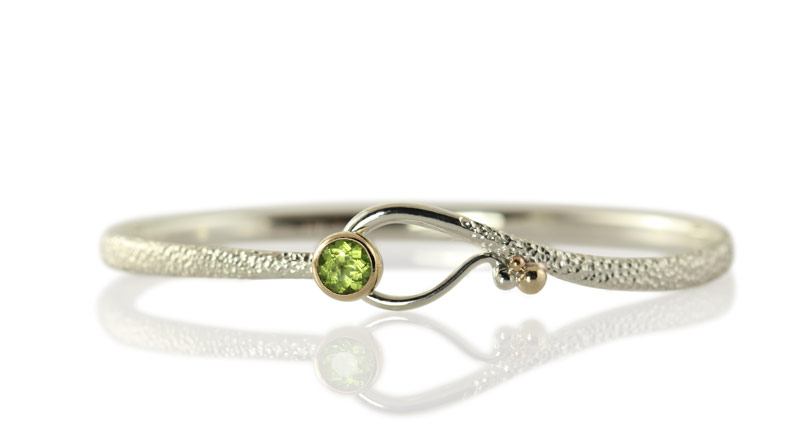
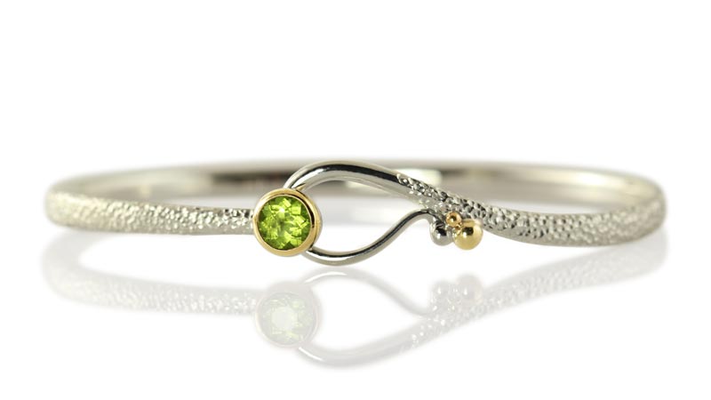
Hooked on you – silver bracelet with peridot set in 18ct gold
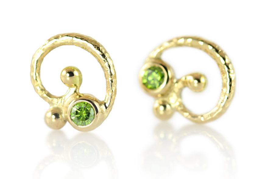 Swirl ear jackets in 14k gold with a total of 0.1 ct green diamonds
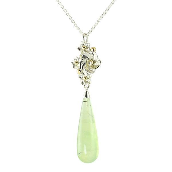 Silver flower bed with 18ct details, 0.02 ct W/SI diamond

Swirl pendant with a heart in silver and 18ct gold, featuring a total of 0.04 ct W/SI diamonds
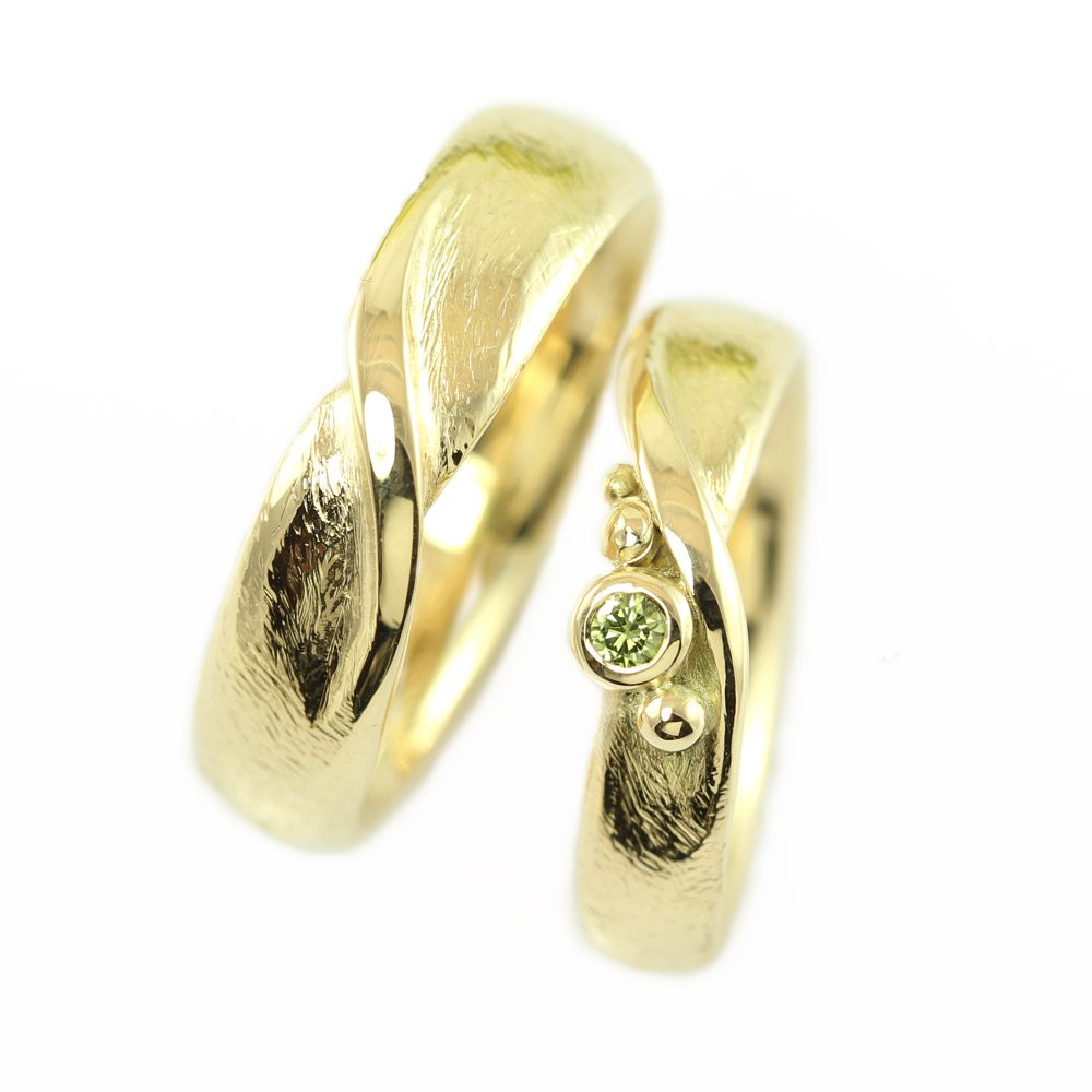
Twisted Möbius wedding rings in 14k gold with a 0.05 ct green diamond
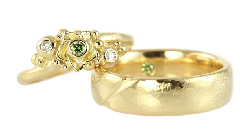
Blooming wedding bands in 14k gold with a total of 0.14 ct green and white diamonds (one is hidden on the inside of his)
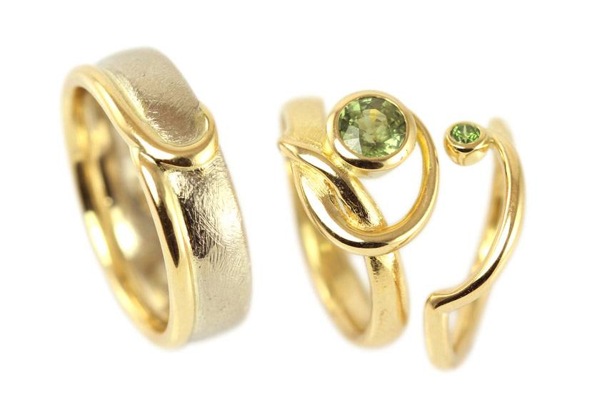 Engagement and wedding ring set in 14k white gold and 18k yellow gold with a green sapphire and a 0.03 ct green diamond (She has both a large engagement ring with the sapphire and a small wedding ring with the diamond)
Would you like your very own ”Greenery” piece of jewellery? Then let's have a chat and design together what your piece of jewellery is going to look like.
About Pantone:
Pantone is a global colour authority and supplier of professional colour standards for diverse design and a wide range of other industries. Pantone has already encouraged colourful research and creativity for more than 50 years and annually maps future colour directions. The institute also conducts research and investigates how colours affect human thought processes, emotions and physical reactions. Pantone works to provide a greater understanding of colour and to help professionals utilise the areas where colour can make a positive difference.
Blog categories